
Algopix (by cluster)
Driving significant user growth
Overview
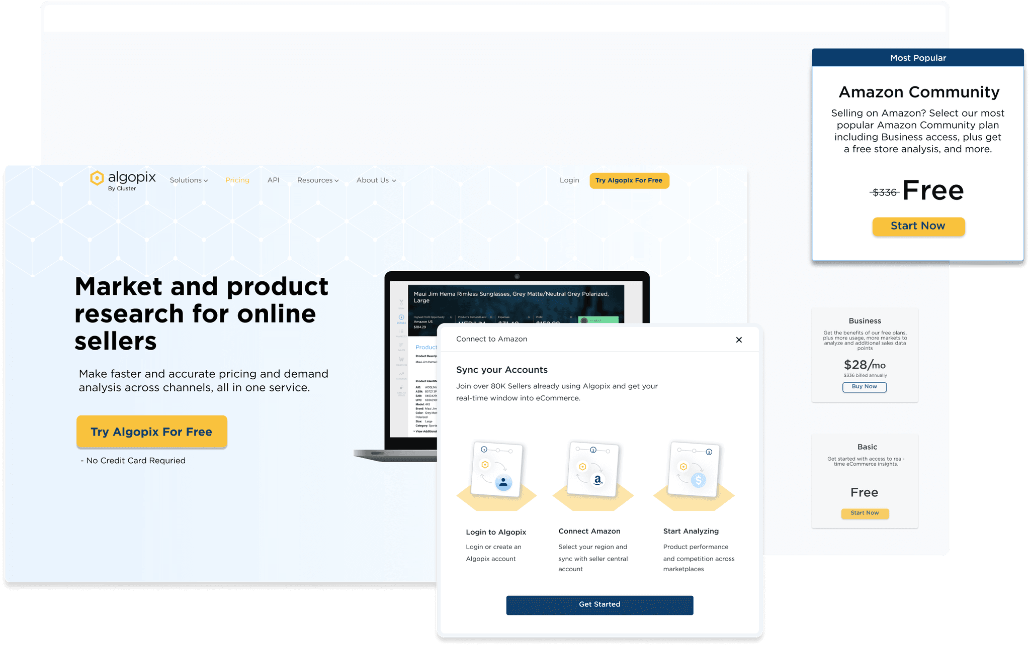
Creating significant growth in Amazon community plan users by changing user flow and redesigning impactful pages. All part of a low-resource project, without a back-end developer.
Timeline
April - July, 2022
responsibilites
Discovery, ideation, decide what redesign, design and execute
TEam
product manager, front-end developer and marketing writer
The company
Algopix helps eCommerce sellers make better inventory decisions. The Amazon community plan integration updated in March 2023 makes it easier to integrate. Amazon APIs and online seller shop data can be accessed through this integration.
My role
As a solo and founding designer, I managed Algopix users and visitors. My responsibility was to make design decisions and lean changes to increase Amazon community plan users by 700% by Q3 2022.
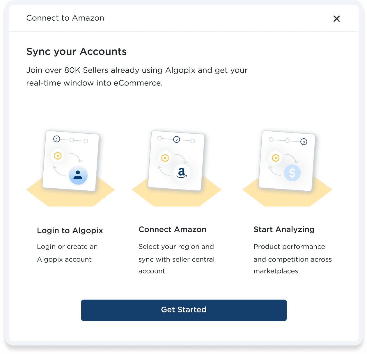
1st page of the updated user integration. New flow is easy, but not enough people reach it.

The Challenge
How to get significant growth in amazon registrations
The company wanted 700% growth by Q3. A merger process was launched in March, but growth wasn't sufficient. Getting Amazon community plan users (Tokens) will improve data, reduce costs, and reduce third-party dependency.
We needed a budget-friendly plan to hit our goal on time. Without back-end developer we needed to decide what tweaks to make and how they'd lead us to the goal.
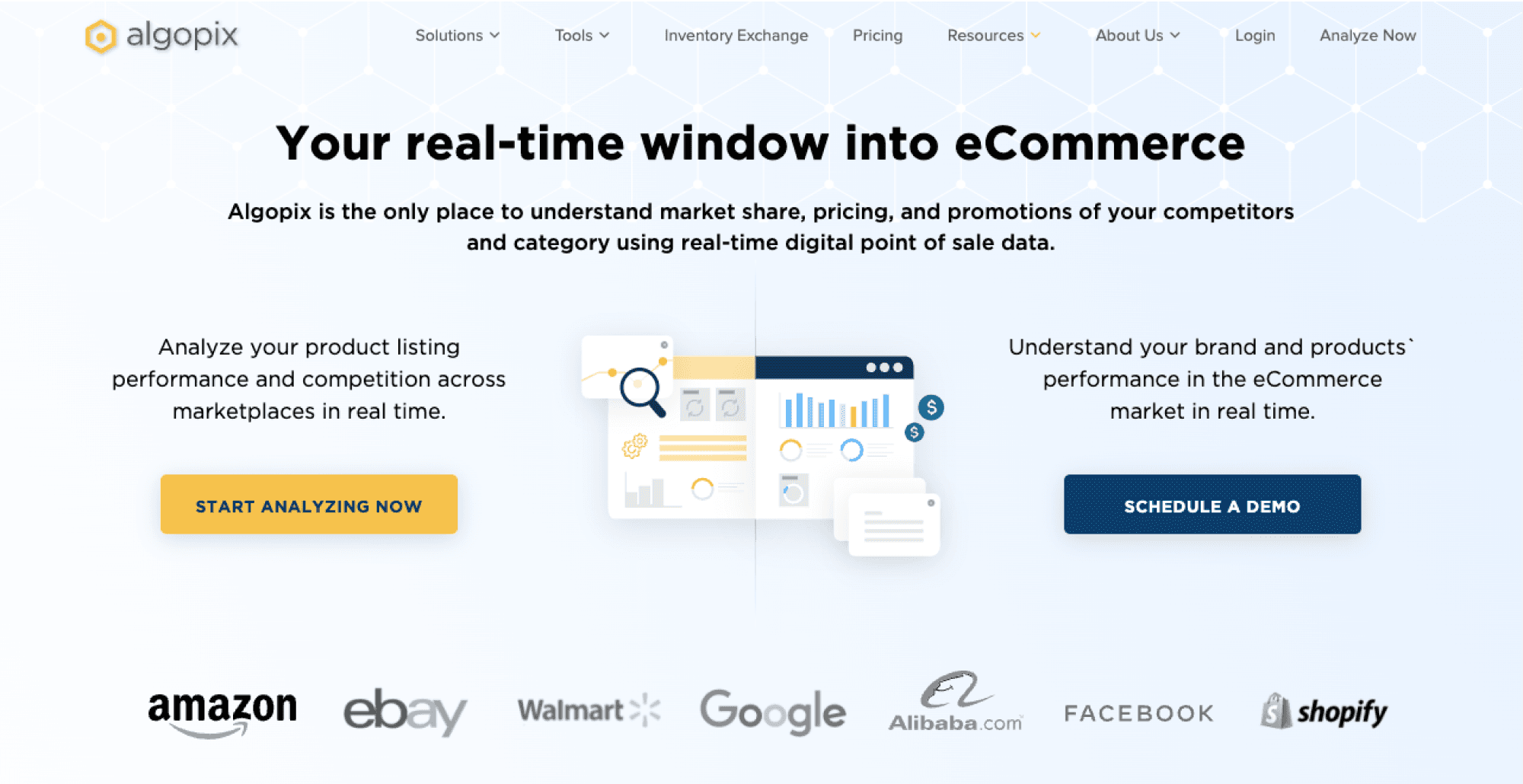
When two CTAs lead to opposite results, how do you grow significantly?


Research
Analyzing user data to find opportunities
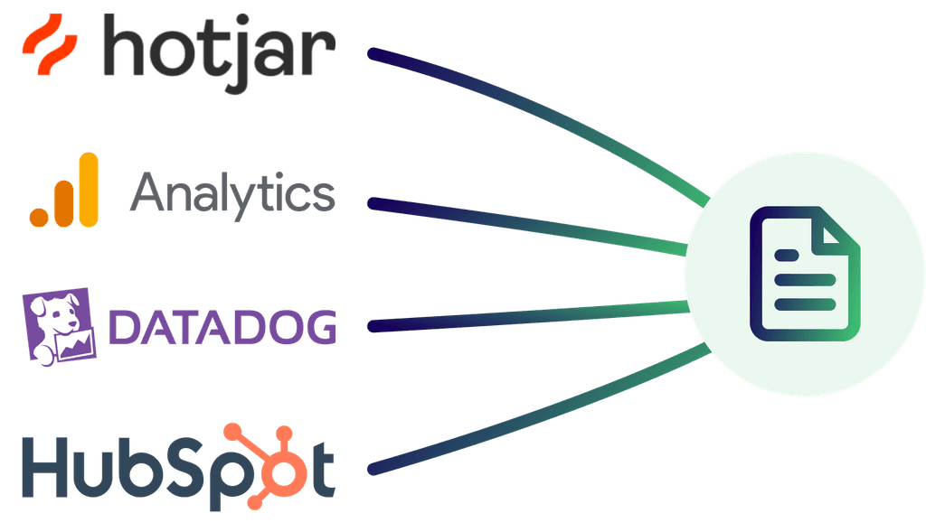
Being in a fast-growing startup, I had to dive into data analysis solo. I pulled data from different places and put it all together. This showed me where we needed to make changes to hit our goals.
After checking out the market and how users behave,
I realized our user flow isn't about turning visitors into Tokens, but into trial users.
Optimizing user flow to reach company goal
Solution
There are 3 areas in the website that I need to redesign and optimize so the users will reach the Amazon community plan and not the trial.
Home page
The high-traffic home page has a 1% conversion rate. To boost it, I suggest simplifying the homepage hero section to one CTA and conducting three A/B tests.
Pricing page
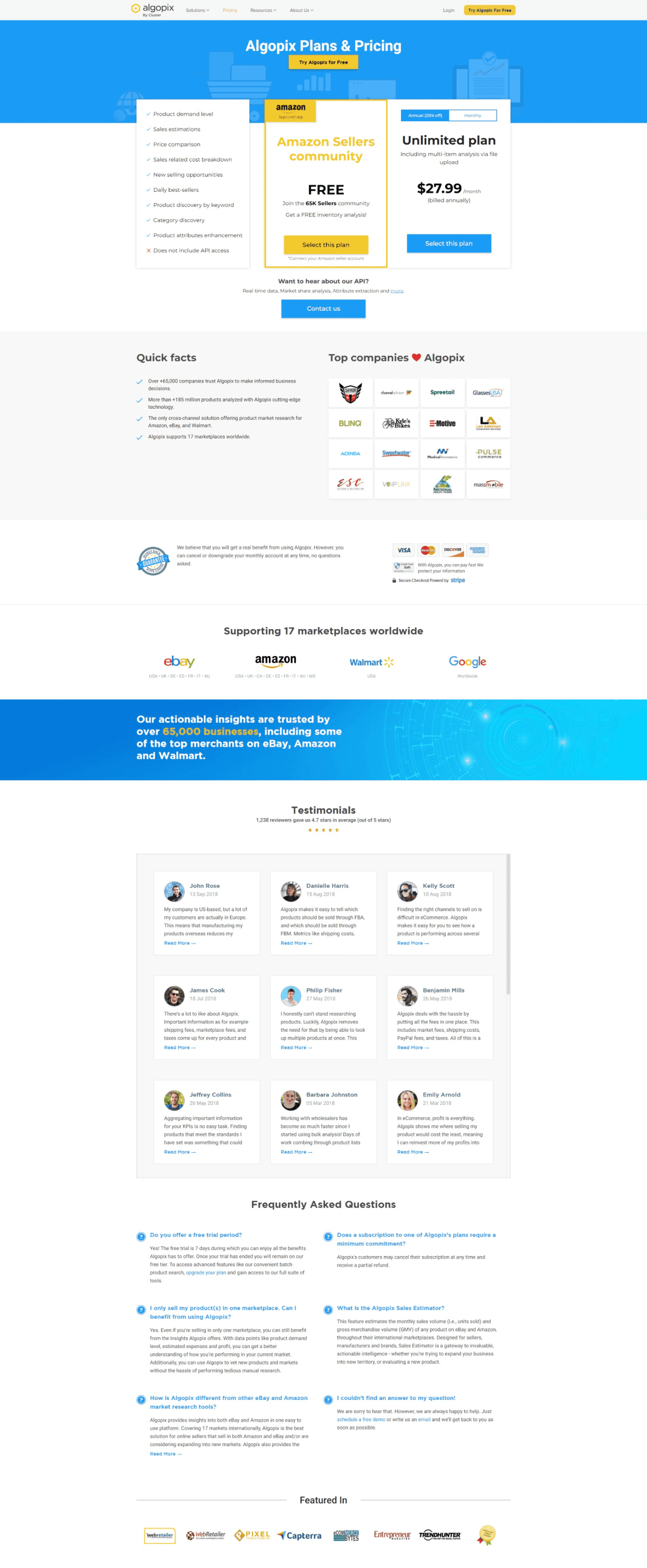
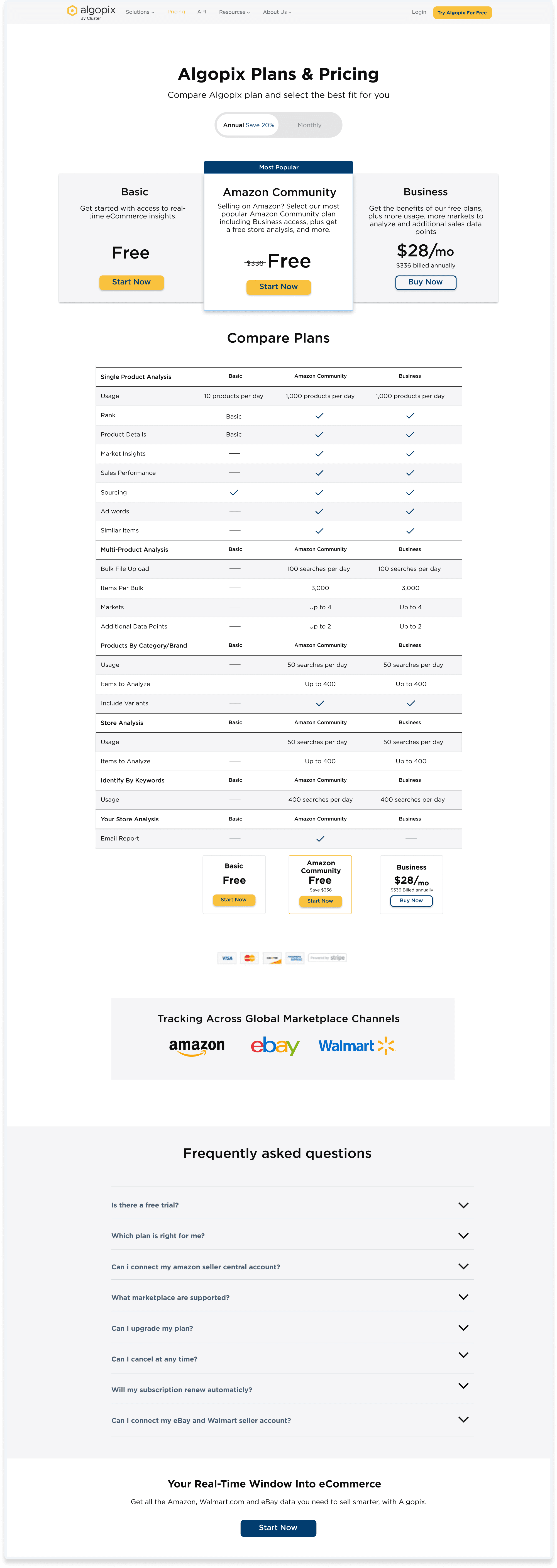
The Amazon Community plan page needs a redesign to address its high bounce rate, which is caused by unclear plans and outdated information.
User conversion flow
The current flow automatically converts users to trials users with the Primary CTA, while the change will redirects this CTA to the pricing page, where users can notice our other offerings.
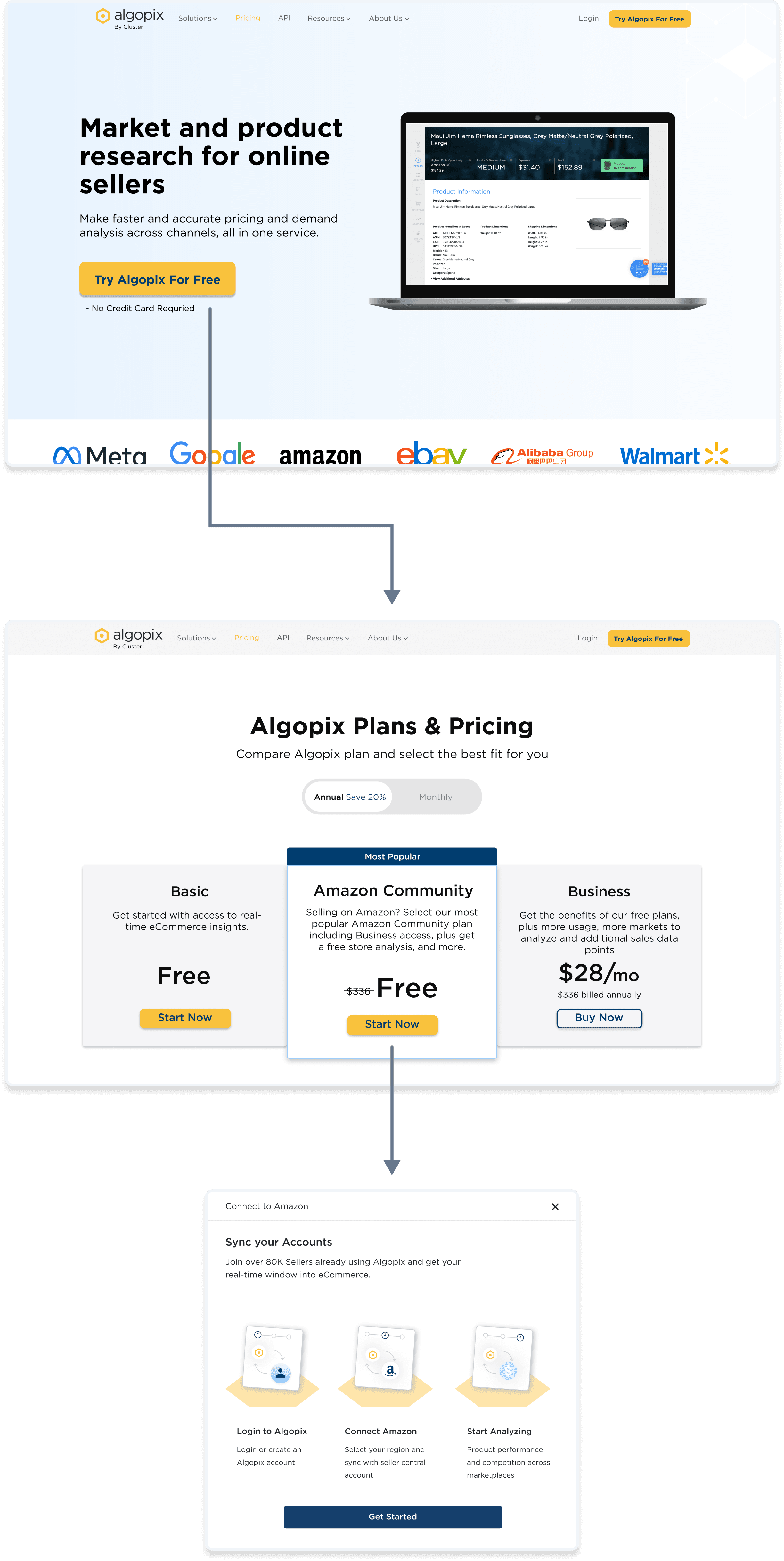

User flow after optimization
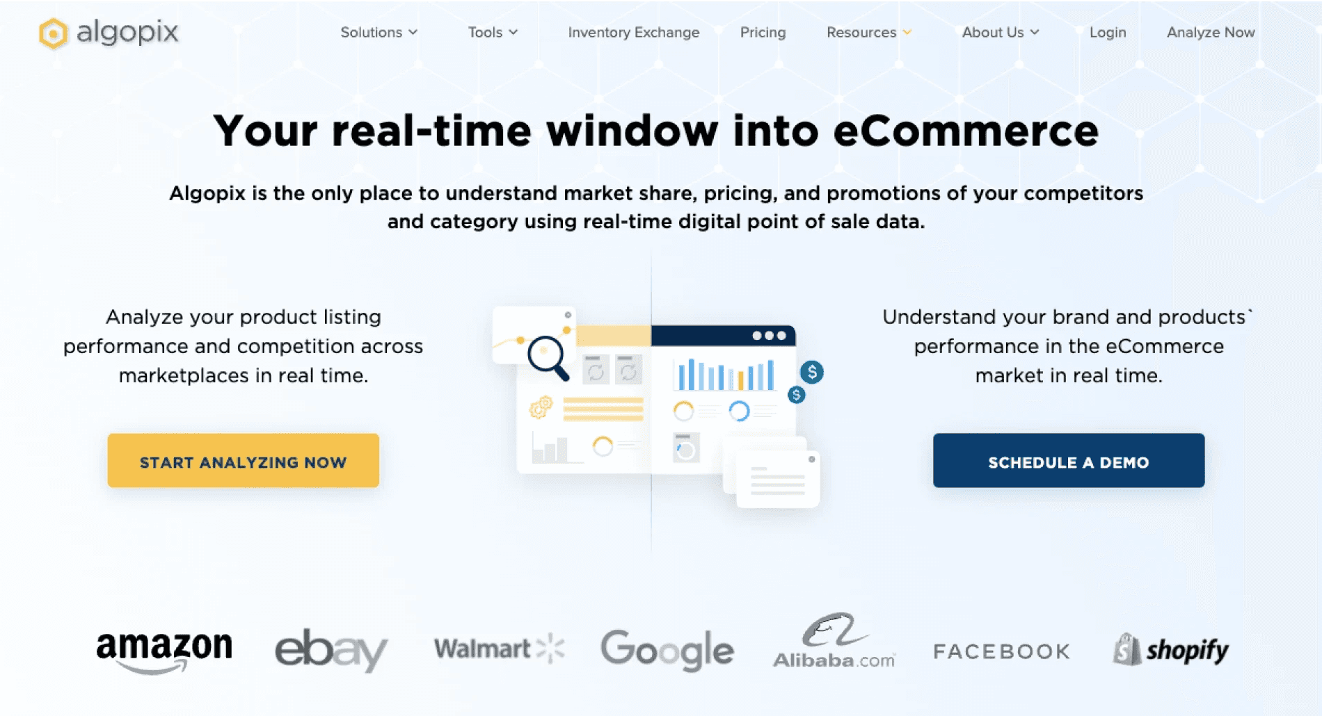
Before - The old hero section

Home page
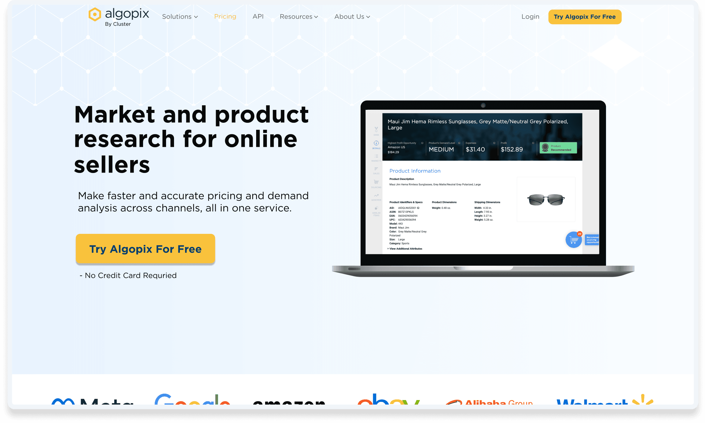



After - New home page hero section, the chosen from 3 A/B tests
Pricing page
Before - unclear and outdated pricing page

After - redesigned pricing page, easy way to understand all our offering

User conversion flow
Before - The old hero section
User Clicks on main CTA
Automatically Subscribe to Trial
After - Optimized user flow
User Clicks on main CTA
Pricing Page
Outcome
Achieving 135% of our total goal
The changes I made led to bigger growth than we expected, as well also to increase in the volume of the company's users.
Additionally, this project led to several other outcomes: enhanced conversion rate, improved aesthetics, increased feature usage, and improved product metrics (average session duration, average pages per session, and reduced bounce rate).
Additional touch
During my research, I found a chance to optimize existing users.
I acted on two fronts: indicting for users with basic plan their plan status, and adding an "update" button. This results in up-sell metrics.
REFLECTION
Creativity as an answer to low dev effort
The project was a big challenge because there was only one front-end developer. This taught me agility and leveraging available resources to reach our goal. It also broadened my skills in cross-department collaboration, communicating with developers, and making decisions with stakeholders.
☕ ️Let’s talk!
C 2024 Olivia dori
Made by me in Framer.com
☕ ️Let’s talk!
C 2024 Olivia dori
Made by me in Framer.com
Algopix (by cluster)
Driving significant user growth
Driving significant user growth


Overview
Creating significant growth in Amazon community plan users by changing user flow and redesigning impactful pages. All part of a low-resource project, without a back-end developer.
Timeline
April - July, 2022
responsibilites
Discovery, ideation, decide what redesign, design and execute
TEam
product manager, front-end developer and marketing writer
The company
Algopix helps eCommerce sellers make better inventory decisions. The Amazon community plan integration updated in March 2023 makes it easier to integrate. Amazon APIs and online seller shop data can be accessed through this integration.
Algopix helps eCommerce sellers make better inventory decisions. The Amazon community plan integration updated in March 2023 makes it easier to integrate. Amazon APIs and online seller shop data can be accessed through this integration.
My role
As a solo and founding designer, I managed Algopix users and visitors. My responsibility was to make design decisions and lean changes to increase Amazon community plan users by 700% by Q3 2022.
As a solo and founding designer, I managed Algopix users and visitors. My responsibility was to make design decisions and lean changes to increase Amazon community plan users by 700% by Q3 2022.


1st page of the updated user integration. New flow is easy, but not enough people reach it.
The Challenge
How to get significant growth in amazon registrations
How to get significant growth in amazon registrations
The company wanted 700% growth by Q3. A merger process was launched in March, but growth wasn't sufficient. Getting Amazon community plan users (Tokens) will improve data, reduce costs, and reduce third-party dependency.
The company wanted 700% growth by Q3. A merger process was launched in March, but growth wasn't sufficient. Getting Amazon community plan users (Tokens) will improve data, reduce costs, and reduce third-party dependency.
We needed a budget-friendly plan to hit our goal on time. Without back-end developer we needed to decide what tweaks to make and how they'd lead us to the goal.
We needed a budget-friendly plan to hit our goal on time. Without back-end developer we needed to decide what tweaks to make and how they'd lead us to the goal.


When two CTAs lead to opposite results, how do you grow significantly?


Data resources I aggregated
Research
Analyzing user data to find opportunities
Analyzing user data to find opportunities
Being in a fast-growing startup, I had to dive into data analysis solo. I pulled data from different places and put it all together. This showed me where we needed to make changes to hit our goals.
Being in a fast-growing startup, I had to dive into data analysis solo. I pulled data from different places and put it all together. This showed me where we needed to make changes to hit our goals.
After checking out the market and how users behave,
I realized our user flow isn't about turning visitors into Tokens, but into trial users.
After checking out the market and how users behave,
I realized our user flow isn't about turning visitors into Tokens, but into trial users.
solution
Optimizing user flow to reach company goal
Optimizing user flow to reach company goal
There are 3 areas in the website that I need to redesign and optimize so the users will reach the Amazon community plan and not the trial.
There are 3 areas in the website that I need to redesign and optimize so the users will reach the Amazon community plan and not the trial.
Home page
The high-traffic home page has a 1% conversion rate. To boost it, I suggest simplifying the homepage hero section to one CTA and conducting three A/B tests.
The high-traffic home page has a 1% conversion rate. To boost it, I suggest simplifying the homepage hero section to one CTA and conducting three A/B tests.
Pricing page
The Amazon Community plan page needs a redesign to address its high bounce rate, which is caused by unclear plans and outdated information.
The Amazon Community plan page needs a redesign to address its high bounce rate, which is caused by unclear plans and outdated information.
User conversion flow
The current flow automatically converts users to trials users with the Primary CTA, while the change will redirects this CTA to the pricing page, where users can notice our other offerings.
The current flow automatically converts users to trials users with the Primary CTA, while the change will redirects this CTA to the pricing page, where users can notice our other offerings.


User flow after optimization
Home page
Home page


Before - The old hero section


After - New home page hero section, the choosen from 3 A/B tests
After - New home page hero section, the choosen from 3 A/B tests
Pricing page


Before - unclear and outdated pricing page


After - redesigned pricing page, easy way to understand all our offering
After - redesigned pricing page, easy way to understand all our offering
User conversion flow
User Clicks on main CTA
Automatically Subscribe to Trial
Before - Old user flow
User Clicks on main CTA
Pricing Page
After - Optimized user flow
Outcome
Achieving 135% of our total goal
Achieving 135% of our total goal
The changes I made led to bigger growth than we expected, as well also to increase in the volume of the company's users.
The changes I made led to bigger growth than we expected, as well also to increase in the volume of the company's users.
Additionally, this project led to several other outcomes: enhanced conversion rate, improved aesthetics, increased feature usage, and improved product metrics (average session duration, average pages per session, and reduced bounce rate).
Additionally, this project led to several other outcomes: enhanced conversion rate, improved aesthetics, increased feature usage, and improved product metrics (average session duration, average pages per session, and reduced bounce rate).
Additional touch
During my research, I found a chance to optimize existing users.
I acted on two fronts: indicting for users with basic plan their plan status, and adding an "update" button. This results in up-sell metrics.
During my research, I found a chance to optimize existing users.
I acted on two fronts: indicting for users with basic plan their plan status, and adding an "update" button. This results in up-sell metrics.
Reflection
Creativity as an answer to low dev effort
Creativity as an answer to low dev effort
The project was a big challenge because there was only one front-end developer. This taught me agility and leveraging available resources to reach our goal. It also broadened my skills in cross-department collaboration, communicating with developers, and making decisions with stakeholders.
The project was a big challenge because there was only one front-end developer. This taught me agility and leveraging available resources to reach our goal. It also broadened my skills in cross-department collaboration, communicating with developers, and making decisions with stakeholders.
Next ->
Providing self service system
☕ ️Let’s talk!
C 2024 Olivia dori
Made by me in Framer.com
☕ ️Let’s talk!
C 2024 Olivia dori
Made by me in Framer.com